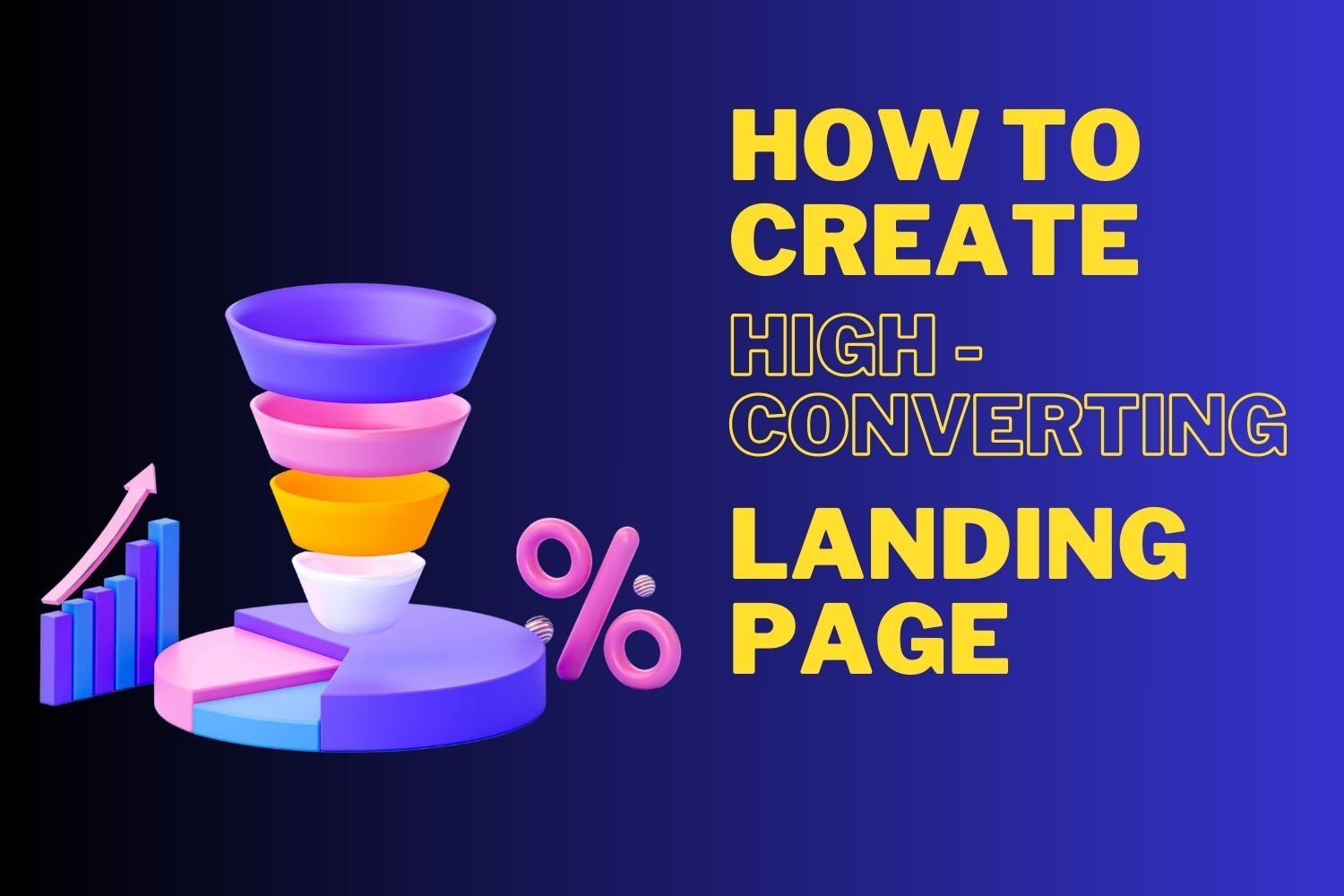
In the world of digital marketing, landing pages play a crucial role in driving conversions. They are the first touchpoint between potential customers and your brand. A well-designed landing page can significantly boost your marketing efforts, turning visitors into leads or customers. In this article, we will explore key strategies to create high-converting landing pages for your digital marketing campaigns.
1. Focus on a Clear and Compelling Headline
The headline is the first thing visitors see when they land on your page. It must be clear, concise, and compelling. A good headline instantly communicates the value of your offer. It should directly address the problem you are solving or the benefits your audience will gain. Keep it simple, but powerful. For example, “Boost Your Sales by 50% in 30 Days” is far more engaging than “Increase Sales with Our Solution.”

For additional tips on writing effective headlines, you can check this guide by HubSpot.
2. Write a Strong and Engaging Subheadline
Once you’ve captured attention with the headline, the subheadline should support it. This text can expand on the promise of your offer, providing a bit more detail to entice visitors to read further. Keep the language simple and ensure it speaks directly to the needs of your audience. The subheadline can add clarity and help maintain interest.
For more on subheadline writing, Crazy Egg provides a great resource.
3. Use Eye-Catching Visuals
Humans are visual creatures, and adding strong imagery to your landing page is key. High-quality images, videos, or graphics that complement your message can keep visitors engaged. Visuals should not be distracting but should enhance the overall appeal of the page. For example, if you are selling a product, showcasing the product in use through a short video or clean image can build trust and interest.
Learn more about how visuals impact user engagement at OptinMonster’s blog on using visuals in marketing.
4. Keep the Call-to-Action (CTA) Front and Center
The call-to-action (CTA) is arguably the most important element of a landing page. It directs users to take the next step, whether it’s signing up for a newsletter, downloading a free resource, or making a purchase. Make your CTA clear, specific, and action-oriented. Use contrasting colors to make it stand out, and place it in a prominent position on the page, usually above the fold.
Examples of strong CTAs include:
- “Download Your Free Guide Now”
- “Get Started Today”
- “Claim Your 20% Discount”
Make sure the CTA is easy to find and understand. You should avoid using multiple CTAs that can confuse or overwhelm visitors.
For more on optimizing CTAs, check out Neil Patel’s guide to call-to-action best practices.
5. Highlight the Benefits Over Features
People are more interested in how your product or service benefits them rather than its features. Focus on the value they will receive. Will your solution save them time, money, or hassle? Will it make their life easier? These are the key points to communicate.
For example, instead of listing technical details about a software product, you could explain how it streamlines their workflow or helps them stay organized. Benefits resonate more with potential customers than lengthy feature lists.
For more insights into benefits-driven copywriting, see this article by Copyblogger.
6. Use Trust Signals to Build Credibility
Trust signals like testimonials, customer reviews, or awards can significantly increase the conversion rate of your landing page. Visitors are more likely to engage with a brand that appears trustworthy. Including logos of well-known clients, industry certifications, or statistics on the number of customers served are great ways to build credibility.
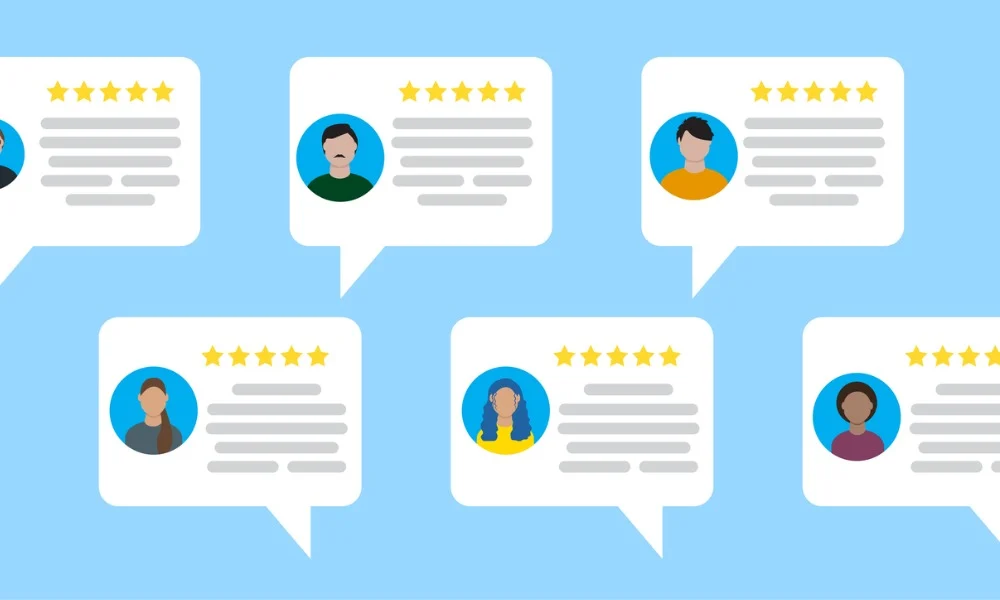
For instance, including a testimonial that says, “This product doubled my sales in just three months!” alongside the customer’s name and picture adds authenticity.
For more information on trust signals, visit CXL’s article on using social proof.
7. Simplify the Form
If your landing page includes a form, keep it as simple as possible. People are more likely to fill out short forms with only essential fields. Typically, asking for a name and email is sufficient for lead generation. If you need more information, make sure to explain why it is needed. Reducing friction by minimizing form fields can have a major impact on conversion rates.
For example, a form with just two fields — name and email — is likely to get more submissions than one asking for a phone number, address, and company details upfront.
Learn how to optimize forms effectively with this guide from Unbounce.
8. Optimize for Mobile
With most users accessing websites through mobile devices, your landing page must be mobile-friendly. Ensure the page loads quickly and is easy to navigate on smaller screens. Buttons should be large enough to tap, text should be readable without zooming in, and forms should be simple to fill out on mobile devices.
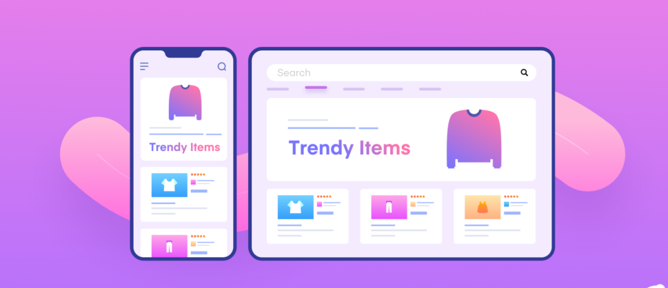
If your landing page is not optimized for mobile, you risk losing a significant portion of potential conversions.
For a complete checklist on mobile optimization, check out this guide from Google.
9. A/B Test Regularly
No landing page is perfect from the start. A/B testing, or split testing, allows you to try different versions of your landing page to see what works best. You can test elements like headlines, CTA buttons, colors, or even the placement of your form. Continually testing and tweaking your landing page will help you optimize for better conversions over time.
For example, you might test whether a red CTA button converts better than a green one. Over time, you’ll gather data on which elements are driving more conversions, allowing you to make informed decisions.
For more on A/B testing, check out this article from VWO.
10. Keep the Design Clean and Simple
A cluttered landing page can overwhelm visitors and push them to leave before converting. Keep your design clean and simple, with plenty of white space. Make sure your messaging is easy to follow and that all elements on the page contribute to the main goal. Avoid unnecessary distractions like too many links, sidebars, or flashy graphics that don’t serve the conversion goal.
Conclusion
A high-converting landing page is essential for digital marketing success. By focusing on clear messaging, engaging visuals, a strong CTA, and trust-building elements, you can turn more visitors into leads and customers. Always remember to keep testing and refining your landing pages based on data to ensure they remain optimized for the best possible performance. With these tips in mind, you’ll be well on your way to improving your campaign’s conversion rates.
For further tips on improving your digital marketing strategy, visit HubSpot’s digital marketing blog.